Hey everybody! I’m in England right now experimenting with meeple themed glass pieces, and I’ve got a question for y’all. I’d like to know which backdrop for the meeples is more popular: black or white.
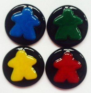
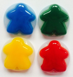
These meeples fused into glass can be used for jewelry, bowls, coasters, and all sorts of other deliciousness. But, I need to know, for the backdrop…
In other news, I’m not alone here in my Guildford studio. At long last, Gertrude has arrived, and she is gert-lorious! We’re having a great time getting to know each other, and I can’t wait to get her back to Malta to meet Dobby!

COLOR POLL!
Gertrude is adorable! I’m sure she and Dobby will hit it off. Can’t wait for her 1st appearance on RRT. 🙂
I like the white just because the meeples stand out better, but I like the smaller sized meeples on the black. Gertrude is a cutie!
Even though I like the idea of the black background, the meeples get lost. The white works better in this case.
Primary colours will always stand out more on black. It’s why a lot of advertisers will use primary colours against black, it makes their logos “pop”. My vote is for black. Cute pup! 😉
I think the yellow and red look best on black but I’m not too sure about the blue and green. The colors look like they’re leeching onto the white so the lines are not as clean looking. I guess I would have to vote for black.
I love Gertrude! She’s just adorable! 🙂
The black background provides sharper outline for Meeples.
She is adorable! We can’t wait to see her on all RAHDO videos. Safe travels back to Malta with her. :0)
Thanks everyone for the votes and comments! That really helps me to prep the backgrounds while I’m in England. I’m taking all the components to Malta so I’ll be able to make custom pieces from there! =)